
i ended up creating a new logo for the company as well as a variation on that logo for the 10th anniversary. the approach i took was to create a simple rocket shape out of the letters of the work 'rocket' which was adapted to use the numbers 1 & 0 for the 10th anniversary:
i was very happy with the end result (especially as I haven't created many logo designs in the past) and i also think the method i used worked quite well, so since then i have been playing around with making other type images in the same way:

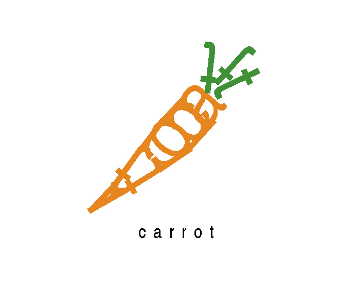
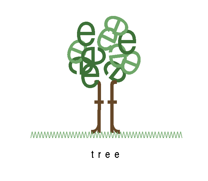
it is a bit tricky trying to use all the letters but also quite fun trying to work it out & i think they are on the whole quite nice (& simple) type illustrations.
x
1 comment:
Post a Comment